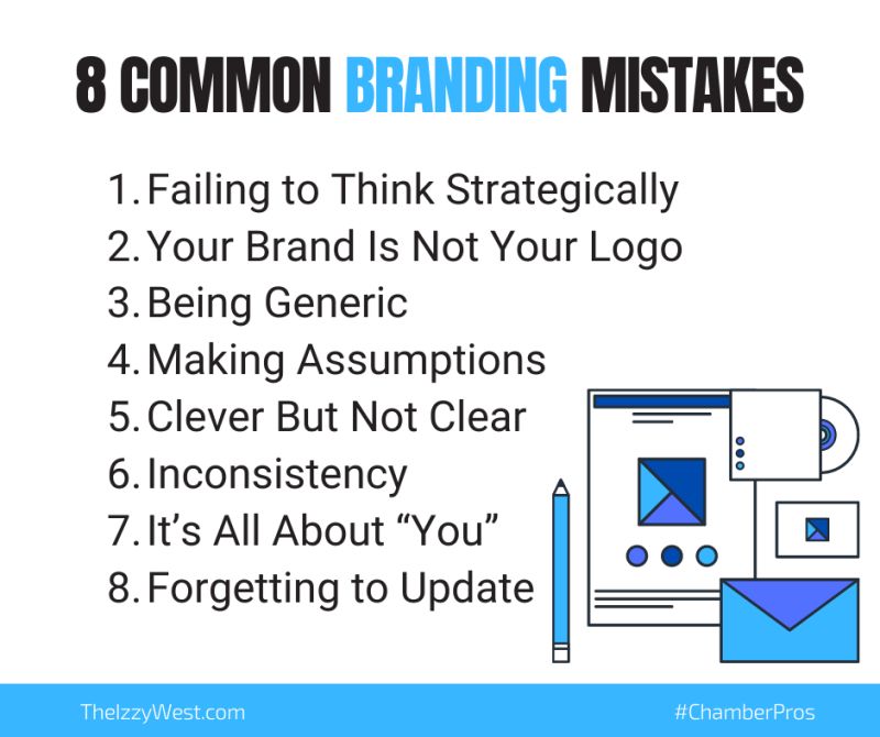
To establish a brand requires a great deal of time and effort, along with some strategic thinking. What if you put in all the work and it falls flat? Since this is an area of business that’s easily misunderstood, here are the biggest mistakes people make with branding so you can avoid them.
Failing to Think Strategically
Branding is part of your overall strategic plan, so you need to be prudent about it. It needs to connect to your “why” and your broader mission.
Go back and review the reasons why your chamber exists and is relevant. Take some time to clarify what you hope to achieve and how your branding will help you do this.
Your Brand Is Not Your Logo
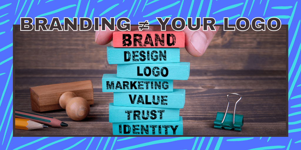
Many people make the mistake of thinking a brand is a logo or a set of design features. While consistent design is an important part of branding, what it’s really about is your messaging and the image you’re creating in the minds of your target market. This message tells people how your offerings uniquely benefit them.
Branding encompasses your member’s or the public’s entire experience with the chamber. Yes, this includes your logo – but it also includes your website, messaging, and general feel for everything you put out.
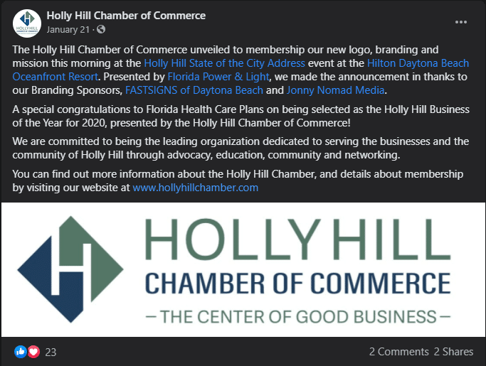
Notice in Holly Hill Chamber’s update, they didn’t just get a new logo. They also updated their mission, got new photography done, and added a tagline.
Being Generic
The whole point of your brand is to differentiate your chamber from competitors in the market. If you can do this successfully, you can compete with bigger companies that have more resources to spend on marketing and advertising. Focus not only on what you do, but what you do differently than the competition.
You may not be competing with other chambers of commerce. BNIs & B2B companies are providing similar services as the chamber. How are you different from them? Do people know that?
Making Assumptions
Don’t make the mistake of building your brand based on assumptions. You think you know how people see your organization, but this isn’t good enough. Get feedback from your members & community. If they don’t know what a chamber is or that your chamber exists – that’s where you need to start.
Clever But Not Clear
I feel like this is an unaddressed problem in the chamber industry. Don’t get so creative that you become hard to understand.
While it’s nice to be cute or witty, the most important thing is for it to be clear. Branding is a form of communication. People should understand your message easily at a glance.
For example, many of us have a program called “Chamber Chat.” But it’s a very different thing for many of us. For one it’s a radio show/ad. For another it’s event with the chamber president. Personally, I think our event or program names should be obvious to someone who’s never heard of the chamber what type of event it is.
Inconsistency Creates Disconnect
If your branding is giving people mixed messages, it’ll be harder to build trust and be memorable.
The message needs to be consistent wherever you have communication with your audience. This might be as simple as using the same fonts & colors from your website on your social media images (templates here), but it’s not just that. The design features, the tone, and the unique benefits of using your products all need to be consistent.
It’s All About “You”
While you’re talking about chamber membership, the real message of your branding should be what being a member does for the business. Focus on their needs and how their lives will be improved by being a member. Example:
Bad: Chamber membership provides a variety of networking opportunities.
Good: The chamber creates numerous opportunities for you to network with local professionals so you can get new ideas, advice, and customers.
See how I took the same benefit, but really spelled out why it benefits them?
Forgetting to Update
The needs of your market and the competitive landscape change over time. Your benefits or target audience might also change to reflect this. When this happens, your branding needs to reflect these changes. Sometimes, you need to assess and update. Branding updates might include designing a new logo, writing a tagline, or just rebranding your events.

Branding can seem overwhelming as it encompasses so much. I think the two bigger, actionable things you can focus on are: follow brand guidelines (colors, fonts, etc) and keep your member in mind whenever creating something new – whether is an ad, Facebook post, or event.
Next:


