If you’ve gone through the trouble of creating a la carte marketing opportunities, use your unsold or open advertising spaces to promote yourself!
This multipurpose strategy can help you: sell more ad spaces (by having an example to show), tip potential members closer towards membership, and re-engage current members with opportunities they didn’t know about.
Ad Spaces You Already Have
To get started, make a quick list of places you sell ad space:
- email newsletter
- print newsletter
- website ads
- exclusive options you only provide to high-tier sponsors
- billboard
- podcast or program sponsor
- at the end of videos
- radio/business/nonprofit spotlights
- etc
Most of these are kind of obvious, but I’d like to explain podcast/program sponsor. Many of the podcasts I listen to promote one of their own upcoming services or products as the ‘sponsor’ where they would usually pitch a paid sponsor. I think this is great because it keeps them in the habit of promoting, and is pretty well targeted at their existing audience.
Similarly, when someone cancels an interview last minute, we will promote the chamber in their slot.
Promote Specific Benefits or Services of Your Chamber
Then make a list combining: your member’s favorite benefits, benefits you wished more people took you up on, and paid add-ons. I’ve generalized some for you, but you want your internal list to be very specific (ie: not just event sponsor, but list every event you would want sponsored).
- exclusive facebook group
- email opt-ins / lead magnets
- host a networking event
- affiliate links / affinity programs
- event sponsorships
- a la carte marketing opportunities
- on-going surveys or submissions
- events/programs (Leadership Program, Young Professionals, etc)
- initiatives/advocacy
- etc.
Then simply combine.
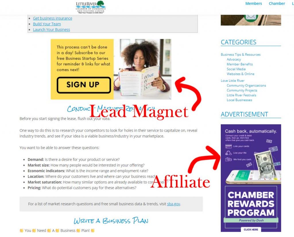
Here’s an example of a blog post on my chamber website that includes a lead magnet ad in the post, and an affiliate ad in the sidebar:

Common Ad Sizes
Most of the time, I create my ads using Canva. I usually create ads specific to the space. To give you an idea, my favorite sizes are:
- 300 x 300 pixels for a website sidebar ad (or reuse a square social media image)
- 480 x 60 pixels for a wider website banner published through ChamberMaster
- 900 x 150 website banner when published manually by me
- 940 x 788 for social media posts
- 600 x 300 for ad in eNewsletter
- 3.6″ x 2″ for print ad (it’s about the size of a business card – so smaller places don’t have to hire a designer)
- 1920 x 1080 for videos
These numbers can change for a variety of reasons, so don’t feel like you have to adhere to my examples!
Calls to Action for Chambers
Next, don’t forget your call to action or destination. You want your ad to have just 1 obvious, no-brain-needed call to action for someone to do. Here are some examples:
- Join now
- Sign up
- Register online
- Call us at #
- Volunteer
- Attend our next event
- Follow us on x
- Save the date
- Take the survey
- Call your elected official
- Schedule an appointment
- Watch now
Generally if you have an ad on a website, people intuitively know if they click on it they’ll be taken to a new webpage. So choose a specific landing page that makes sense for what you’ve put in your ad (not just your homepage).
In other cases you might want people to call you. For these, make sure it’s clear in your ad.
‘Repurpose’ Your Ads in a Public Media Kit
And since you’ve taken the time to create some ads for your chamber, why not make them available for others to get to promote you?!
Simply put a collection of your more timeless/dateless ads in a Dropbox (or similar) folder and make it accessible on your website.
Next:


