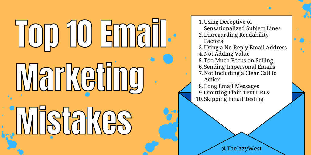
Email marketing is the most effective form of marketing. It allows you to connect with your target market, build relationships, and achieve a closeness that is unheard of with other marketing methods. Keep these top 10 marketing mistakes to a minimum for more success.
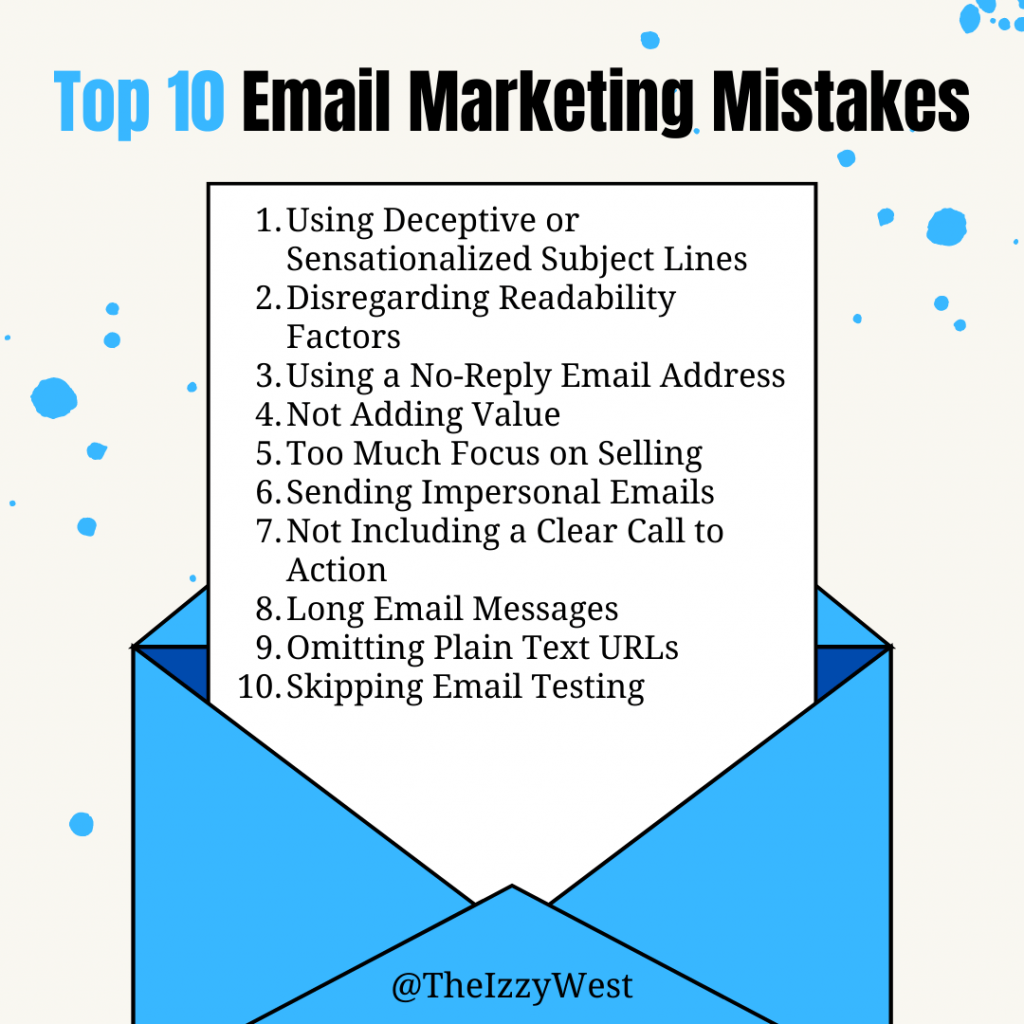
Mistake #1: Using Deceptive Sensationalized Subject Lines
The subject line of your email determines whether readers open it or trash it. In trying to create interest, many marketers mistakenly go overboard and use sensationalized subject lines. These are also known as click-bait titles. When clicked, the email doesn’t deliver the content promised in the title. This leads your audience to mistrust you because they think you “have something up your sleeve” and have tricked them. When they feel this way, they will unsubscribe in droves.
Use subject lines that make readers curious about the details in the email. Keep the subject line short and simple to encourage readers to click and read. Deliver the content you hinted at in the subject line to make subscribers glad that they clicked to read.
Mistake #2: Disregarding Readability Factors
Technology advancements make it easier than ever to send and read email messages. However, because your audience can use a huge variety of devices, browsers, and apps to read email, there are many readability factors you need to consider when creating an email message. Your audience should be able to open and read your email messages regardless of the device or software that is used.
This can often mean choosing to be clear over clever or cute.
Ensure that readability is not a problem by keeping the format simple and using software that automatically adjusts for the subscriber’s device, browser, and app. Since you will be adding a call to action link, make sure that the link’s destination page is also responsive and can be easily accessed and read. Don’t spend a lot of effort on trying to make your emails look too fancy – some people’s email browser might ruin some of your efforts without you realizing. A simple example is to check the links in emails on your phone – often these are changed to a default color by the device or browser settings. For this reason, my emails primarily have a white background and a dark text because it’s easier to read on all devices.
When you design your next email, pretend someone’s older, tech-challenged grandma with bad eyesight is going to be getting your email. This will actually benefit more people than you realize.
Readability also includes your verbiage. If you had to re-read something twice, then chances are it’s not clear enough for your readers.
Consider the fact that your email open rate will always be less than 100%. Additionally, just because people did open your email doesn’t mean they actually read the whole thing. Increase the chances of people actually reading your emails by making them short & easy to read.
Mistake #3: Using a No-Reply Email Address
Using a “no-reply” email address discourages interaction with your readers. It can also give them the impression that you don’t care what they think or need. When subscribers feel this way, they are more apt to mark the email as spam or unsubscribe from your list.
Both of these actions can hurt your reputation, limit your click-through rate, and reduce your profits. It can even lead to your domain or IP being blacklisted by the user’s email client, if the email is marked as spam. This can have a far-reaching effect on your overall deliverability.
Strongly encourage subscribers to “whitelist” your email address and use your support system to ask questions or make suggestions. Add a prominent support link to the bottom of each email and use the appropriate “reply-to” features in your email system. Make sure you keep the line of communications open.
Also, make it easy for readers to adjust their subscription options. It beats the heck out of being marked as spam and blacklisted.
Mistake #4: Not Adding Value
When you have someone’s email address, you have a greater connection with them than you may realize. They have made your emails a priority. Your subscribers give you the gift of accessibility because they feel that you add value to their lives. They want and need to hear from you.
Take this show of trust seriously. Show your appreciation. Make sure every message you send is valuable to them. If it doesn’t add value, don’t send it.
To make your emails more valuable to your readers, focus on your audience’s needs. Provide niche related solutions, suggestions, sources, services, and more.
Mistake #5: Too Much Focus on Selling
Emails that focus on making a sale tend to turn subscribers off. These types of emails often focus on a product or service and have multiple “buy” or “learn more” links in them. Instead of emailing about the product or service, email about the niche related problem your audience faces.
Help readers, who have the specific problem, see that they aren’t alone and helpless. There are things they can do to fix or make things better. In other words, give them hope and then suggest a well-researched solution or information that will enable them to discover other options.
The key is to make your email primarily focused on the people, their feelings, their needs, and the things that are important to them. Benefits of the solution or information you provide should be secondary and details about product features should come last.
Mistake #6: Sending Impersonal Emails
Many things can make an email message seem impersonal. The tone and voice of the message play a large part in how your audience perceives your message. It’s important to talk to your audience in a friendly tone. Your message should sound as if you are emailing a friend. Use “you” instead of “some of you” or other group references.
Begin your messages with a friendly greeting like, “Hi (readers first name). Start your message by saying something semi-personal about yourself that your readers can relate to. This should lead into your reason for emailing. End with a unique “signature closing” and sign your name.
While you might still have many emails that you can’t do this for, consider what value-based emails you can add or improve that does do this.
Mistake #7: Not Including a Clear Call to Action
For each email that you send, you should include one call to action. It doesn’t matter if the call to action is for them to buy something, share something, download something, or sign up for something. Give them a clear call to action. Tell them what you want them to do next, which is click the link, and why they should take your suggestion.
For events you might have them register or click for physical directions. For advertising opportunities, you might want them to reply to the email or click to download a PDF.
Try to keep the number of links to about 2-3. Offer one solution per email. Your audience will get overwhelmed if you give them too many options and they will be unsure of what they should click on.
I realize chambers all send newsletters that breaks this rule, but consider checking the heat map of your last email newsletter with a lot of clicks. Most likely the most clicks happened at the top of the email, so put your most important content there.
Mistake #8: Long Email Messages
While long articles are a good idea, long emails aren’t. Each email should cover one main point and contain only 2 or 3 links. If you have a lot to say, send them to a related post or article on your website to share additional information.
Remember that most people skim email messages, initially. It’s important to keep your messages short. You don’t want lose the reader’s attention. In addition to shortening your emails, add visual elements that make it easier to skim, like bold text, bullet points, headlines, or graphics.
If you find your emails are getting too long, but you can’t cut content, consider sending more emails. I know, that sounds crazy coming from me! But, hear me out. Instead of one super-long detailed email, can you create an email ‘campaign’ that breaks up the the content into several smaller emails?
When working on my chamber’s weekly email newsletter, I found the ‘new member’ section is what made it hard for me to schedule the email on time. So I cut that section out of the newsletter and instead sent a quarterly email featuring the newest members.
Another way I shortened by newsletter was by creating rules that allowed me to reduce member-provided content (don’t worry – they still had opportunities!).
When I first started, our newsletter was 9 printed pages long. First, I got rid of all member-events because it was simply too much information that nobody was reading. I also created a new rule that instead of forwarding me content/emails, members had to submit information for the newsletter by creating a deal, job, or press release on the chamber website. These were automatically checked by me when creating each newsletter & included for free. And I was still able to shorten the newsletter by linking to these instead of pasting the allll of the information provided.
Or if members wanted something more or different, then they could pay a nominal fee of $20 for a newsletter. This kept things affordable for small businesses, but reduced the amount of staff time spent on ‘freebies’ & things that didn’t actually matter that much to the business.
Mistake #9: Omitting Plain Text URLs
There are several reasons to include plain text links in your emails. In email, include a plain text link as well as a regular link with anchor text. Some email clients and apps don’t handle HTML as well as others. Email filters are less likely to send it to the spam folder when you have a smaller amount of linked text.
A plain text link means that instead of the link reading ‘click here,’ it literally reads the full url like ‘https://theizzywest.com/category/email-marketing/.’
Some people prefer to see the full URL as well. It helps them see where the link goes. Providing both an anchored link as well as a plain text link makes your emails valuable no matter which format your readers prefer to receive.
Mistake #10: Skipping Email Testing
Writing and sending email seems easy. But, like other content, it needs to be planned, written, and edited. It also needs to be formatted and links added. Then, it should be tested, read, and edited again where needed. Most email clients allow you to test by sending the email to one address.
Testing each email before you send it to your list is very important. Look for readability issues, things you forgot to change (like the subject line), and most importantly, correct links. Checking the links and fixing problems, helps to reduce reader frustration and increase actions. When a link doesn’t work correctly, readers often click away and never go back to take the action you suggested.
Make it a priority to fix or avoid these top 10 email marketing mistakes. Keep your audience happy and coming back for more of your helpful information and solutions.
Next:

