Basic Email Recommendations
- Emails should be 1-column templates (more mobile-friendly)
- Text & colors should be easy to read
- Every email should be branded with your logo, website & social links
- Your emails also shouldn’t be too long. If they are, try to see what you can cut out or reduce.
- Example: Instead of paragraphs of information on one event, just link to the event.
- Example: Greater Reading Chamber Alliance splits their newsletter into two different ones: a weekly Chamber News and bi-weekly Member News
Favourite Four
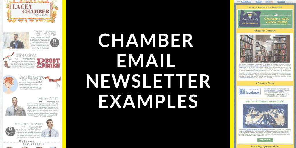
Obviously emails get pretty long, so I’ve only saved my top 4 choices as images. If you click the image, you open up their email in a new tab on your browser. (There’s a list of more chamber eNewsletters below.)

More Examples
In case you like tons of examples, here’s a few more chamber emails I found:
- Allen Fairview Chamber
- Bellaire Chamber
- Cape Chamber
- Eastvale Chamber
- Greenville Area Chamber
- Mecosta County Chamber
- Shelton Mason County Chamber
- St. Thomas & District Chamber
- SC SBDC
- Wyandot Chamber
- Non-Chamber Newsletter Examples
I hope this helped! Share your eNewsletter questions, tips, or links in the comments below.


No Comments